

A road trip to financial freedom
How to diversify your global ETF portfolio like a pro
By Lizelle Steyn
Updated 15 March 2023

Photo credit: cottonbro
It’s always interesting to hear what other investors have in their portfolio, and what they grapple with, like how to diversify a global equity ETF portfolio. If you don't know which indices cover which world markets, it's easy to duplicate and increase your exposure to specific companies - often dominating tech stocks - and thereby 'di-worse-ify' instead of diversify your portfolio. Avoid this mistake by knowing your ‘index geography’. Once you can confidently point out which part of the map your global ETF covers, you can clearly see where you don't yet have exposure and what to add to truly diversify.
(This post covers only the equity portion of your global ETF portfolio; not your entire ETF portfolio diversification, which was covered in a previous post.)
The global equity index universe – our ‘map’
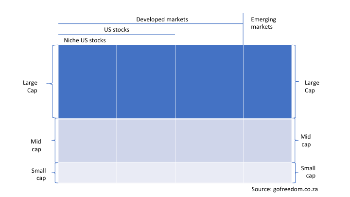
This global equity index map was inspired by the Global Equity Investing webinar of Kingsley Williams from Satrix.
To understand this 'map' of companies listed on the main stock exchanges of the world, let’s look at what each category means.
Developed markets
Developed markets have a higher GDP (economic output) per citizen than the rest of the world and they generally have more developed financial systems and good infrastructure in place. It doesn’t mean these countries have higher economic growth; only a bigger economy per person.The list include the likes of the US, UK, Switzerland, most of the EU, Japan, Australia and Canada. Hong Kong and Singapore are included, but China is still excluded at this stage.
Emerging markets
An emerging market economy is one that is in the process of becoming a developed economy.
Large cap
‘Cap’ is short for market capitalisation, which is the market value of all the shares listed on a stock exchange by a particular company. As the market value changes from day to day, companies can move in and out of the large, mid and small cap categories as they grow or shrink in value. Large cap refers to the biggest companies on any particular stock exchange as measured by their market value. In South Africa the top 40 companies are considered ‘large cap’; in the US the top 500 US companies are viewed by index compiler Standard&Poor’s (S&P) as large cap. The number will differ from index to index.
Mid cap
Mid cap companies are simply the next tier of companies under large caps when measured by the market value of their listed shares.
Small cap
Small cap companies are the ‘tail end’ of stocks listed on any particular exchange. They are generally not so easy to trade in and out of and are for that reason excluded from most major global indices.
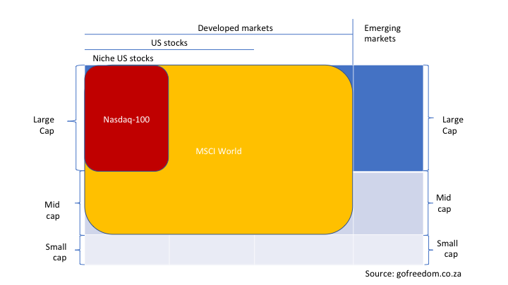
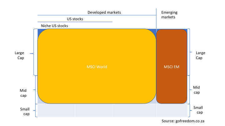
Using our equity index map above as a framework, let’s take a few of the most popular global equity indices and ‘colour in’ which parts of our universe they cover.
The Nasdaq-100 Index
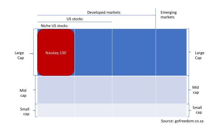
The Nasdaq-100 is focused on the largest +/- 100 stocks on one US stock exchange only – the Nasdaq. It excludes financial stocks and is tech heavy. Investing in the Nasdaq-100 is partly a geographic call (US only) and partly a thematic play, taking a bet on tech stocks. The Satrix Nasdaq 100 is an example of a local ETF that gives you exposure to this index.
The S&P 500 Index
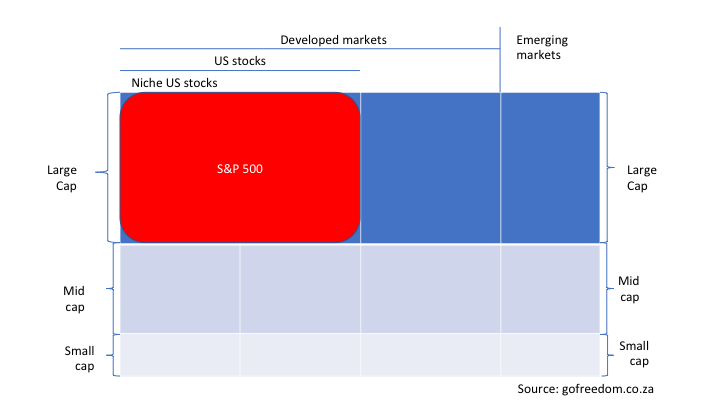
Like the Nasdaq, the S&P 500 includes only US stocks, but at least it includes companies listed on several US exchanges. It’s also a large cap index and makes up just under two-thirds of the MSCI World, showing how dominant US large caps are in develop markets. And around 70% of the earnings by these US-listed (but globally operational) companies come from sales in the US. The 1nvest 500 is an example of a local ETF that gives you exposure to this index.
The MSCI World Index
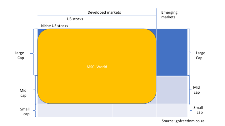
Like S&P, MSCI is a large and established index provider. The MSCI World Index is wider than the US and includes all developed markets. Not only does the MSCI World cast its net wider than the Nasdaq-100 and the S&P 500 on a geographical basis, it also includes mid cap stocks, covering about 85% of the market cap in each of the 23 developed market countries included in the index. The likes of the US, UK, Switzerland, most of the EU, Japan, Australia and Canada are included. Hong Kong and Singapore are also in, but China is still excluded at this stage. The Satrix and Sygnia iTrix MSCI World are examples of local ETFs that give you exposure to this index.
The MSCI Emerging Markets (EM) Index
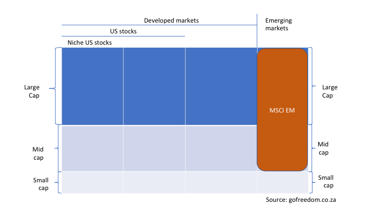
For emerging markets we have the MSCI EM Index, which runs alongside and doesn't overlap with any country in the MSCI World Index. It includes large and mid caps and covers 85% of the market cap of each country. It includes 27 countries, with Greece, the Czech Republic, Poland and the UAE among them. The Satrix MSCI Emerging Markets ETF is an example of a local ETF that gives you exposure to this index.
The MSCI EM Investable Market Index (IMI)
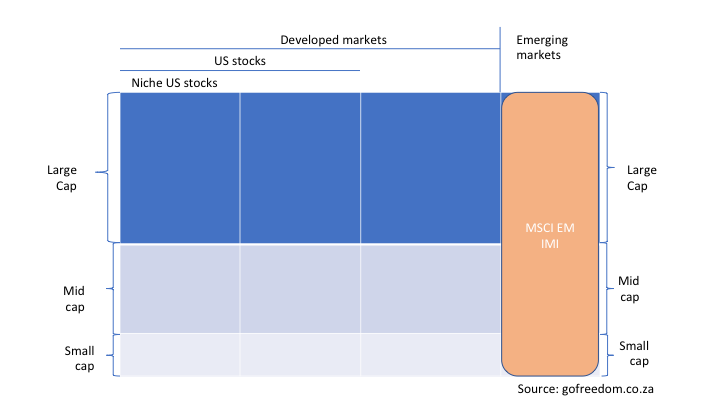
This is not a commonly used global equity index, but I’ve included this one just to show you what the ‘IMI’ at the end of an index or ETF name means: investable market index. IMI indices include small caps on top of mid and large caps. It’s debatable whether adding the tail end of a stock exchange is worth the often extra cost of tracking these small and hard-to-trade companies.
The S&P Global 1200 Index
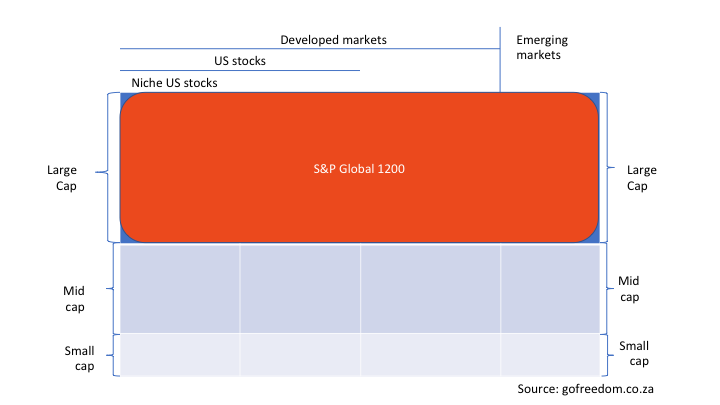
The S&P Global 1200 is a popular index which covers both developed and emerging markets, but focuses on the large caps only. Only about 6% of the index is allocated to emerging markets. During 2020 the S&P Global 1200 changed to a composite of seven other indices – it’s an index made up of seven other indices. This means local ETF providers tracking this index now have a fund of funds (fund of ETFs) structure to bring down the management fee (good news). The FNB Global 1200 is an example of a local ETF that gives you exposure to this index.
The MSCI All Country World Index (ACWI)
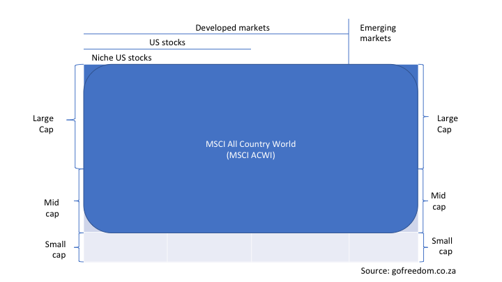
The MSCI ACWI is an index with even broader coverage than the S&P 1200, as it includes mid-cap stocks too in developed and emerging markets. When tracking this index, you are invested in just under 85% of world market capitalisation (the market value of all shares listed in the world.)
The FTSE Global All Cap Index
The FTSE Global All Cap Index is an even broader index than the MSCI ACWI. It includes large-, mid-, and small-cap stocks in developed and emerging markets. 89% of the index is in developed markets and 11% in emerging markets. When tracking this index, you are invested in 98% of the world market! The CoreShares Total World is an example of a local ETF that gives you exposure to this broad index. When you own this ETF, you are as-good-as fully diversified across global stocks.
A comparison between global equity indices
Now that we’ve mapped out the main global equity indices, it’s time to check their fund factsheets and find out how many stocks they invest in and what their biggest holdings and largest country exposures are. For diversification purposes, we're interested in the info summarised in the table below.
Table: global equity index comparison
| Index | Nasdaq-100 | S&P 500 | MSCI World | MSCI EM | S&P Global 1200 | FTSE Global All Cap |
|---|---|---|---|---|---|---|
| # of countries | 1 – and only 1 stock exchange | 1 – but several stock exchanges | 23 DM countries | 27 EM countries | 30 | 49 |
| Developed or emerging market | Developed | Developed | Developed | Emerging | Developed + Emerging | Developed + Emerging |
| Large cap | Yes | Yes | Yes | Yes | Yes | Yes |
| Mid cap | No | No | Yes | Yes | No | Yes |
| # of stocks | About 100 | About 500 | About 1600 | About 1400 | About 1200 | More than 9000 |
| % of world market | More than 60% | About 80% | About 5% | About 70% | About 98% | |
| Top 5 companies | Apple (12%) Microsoft (12%) Alphabet (8%) Amazon (7%) Nvidia (4%) |
Apple (6%) Microsoft (5%) Alphabet (3%) Amazon (3%) Berkshire (2%) |
Apple (5%) Microsoft (3%) Amazon (2%) Alphabet (2%) Nvidia (1%) |
Taiwan semiconductor (6%) Tencent (4%) Samsung (3%) Alibaba (3%) Reliance (1%) |
Apple (7%) Microsoft (5%) Alphabet (3%) Amazon (4%) Nvidia (2%) |
Apple (3%) Microsoft (3%) Alphabet (2%) Amazon (1%) United Health (1%) |
| Top 3 countries | US (100%) | US (100%) | US (68%) Japan (6%) UK (4%) |
China (32%) Taiwan (15%) South Korea (12%) |
US (64%) Japan (6%) UK (5%) |
US (57%) Japan (7%) China (5%) |
Source: gofreedom.co.za | March 2023
Three things struck me as I delved deeper into each index:
- Even an index as wide as the MSCI ACWI invests in only 50 of the approximately 195 countries in the world. (Let’s keep in mind that borders are continuously contested.)
- The market value of emerging markets is much smaller than I thought – about 10% of the value of all companies listed in the world fall in this category.
- Not only the Nasdaq, but all the indices tabled above have significant exposure to tech stocks. Note that the top 5 companies in all the indices are predominantly tech players.
Examples of local ETFs that track the global equity indices mentioned above
What is the relationship between an ETF and an index? An index provider like S&P or MSCI build an index, eg the MSCI World Index. An ETF provider like Satrix or Sygnia then takes your rands and either buy (in dollars) into an offshore fund that tracks the same index or buy (also in dollars) the individual stocks listed in the index. They report back to you the performance of your rands - taking into account both the currency fluctuation and the performance of the stocks in the index.
Here are some examples of local ETFs that track the global equity indices mentioned above:
| Nasdaq-100 | S&P 500 | MSCI World | MSCI EM | S&P Global 1200 | FTSE Global All Cap |
|---|---|---|---|---|---|
| Satrix Nasdaq 100 | Coreshares S&P 500 | Satrix MSCI World | Satrix MSCI Emerging Markets | FNB Global 1200 | CoreShares Total World |
| Satrix S&P 500 | Sygnia iTrix MSCI World | Sygnia Itrix S&P Global 1200 ESG | |||
| Sygnia iTrix S&P 500 | 1nvest MSCI World | ||||
| 1nvest S&P 500 |
It’s easy to make things worse when trying to diversify your ETF portfolio
What both the maps and the table comparing global equity indices brought home to me is how much these indices often overlap and how easy it is to make things worse when trying to diversify your ETF portfolio by adding another global equity index. Look for example what happens when you add the Satrix Nasdaq 100 to your Satrix MSCI World ETF. Instead of diversifying into the ‘not yet covered’ sections of our map, you’ll be making your portfolio even more concentrated in the dominant US and tech stock section.
Example of the most pointless form of diversification
The most pointless form of diversification must be adding the exact same index, but tracked by a different ETF provider, for example adding the 1nvest MSCI World Index Feeder ETF to your Satrix MSCI World ETF. The only 'diversification' you're getting is having the exact same coverage provided by a different ETF brand.
What does successful global equity ETF diversification look like?
What does successful global equity ETF diversification look like? Start with the global ETF you already have in your portfolio and ‘colour in’ the sections of our map which it covers. Then look for other global ETFs that don’t overlap the coloured-in area, or which only partly overlap. An example would be adding the Satrix MSCI Emerging Markets ETF to the Satrix MSCI World ETF. If you're in the Coreshares Total World, you would have already covered the entire global equity map we use here. In that case, to diversify, you might want to look outside the global equity universe, and add a global property or a local bond ETF to your global equity ETF. In other words, decide whether you want to diversify away from the global equity asset class into the global listed property asset class or bond class. But bear in mind that over the long term (10+ years) equity normally outperforms property and bonds.
As soon as you’re comfortable with the key differences between the world’s main indices, you’ll be able to diversify your global ETF portfolio like a pro.
Related blog posts

How to DIY asset allocation and build your own ETF portfolio
20 January 2021
While the unit trust industry has too many balanced multi asset funds, the ETF industry has significantly less to choose from. And maybe you're not a fan of any of the brands that put those index tracking balanced funds together. You'll need to do more research and it's clearly more work, but if you'd rather build your own multi asset ETF portfolio, this is how you go about it.

Asset allocation - the most powerful driver of portfolio performance
5 January 2021
The FIRE movement has become obsessed with choosing funds with the lowest fees. But are we forgetting the main driver of portfolio performance - asset allocation? 2020 has been an excellent example of how different asset allocation choices can lead to wildly different investment returns.